
CHG time indexing web tool
Improving task management worklfow for CHG’s internal web tool
Overview
In the fast-paced healthcare staffing world of CHG’s enterprise applications, notifications are the lifeblood of timely communication. However, balancing the deluge of alerts with user satisfaction is no small feat.
I was tasked with helping the CHG internal tool team design features for an internal timesheet processing tool. As the team consisted of only engineering and product managers, I was brought on as the UX designer to assist with new feature designs .
My team
Me ( UX design) - Interaction design, user research, wireframing, and prototyping
Brandon Hines ( product manager )
Nirmal Poudyal ( lead engineer )
The Problem: When Notifications Overwhelm Instead of Inform
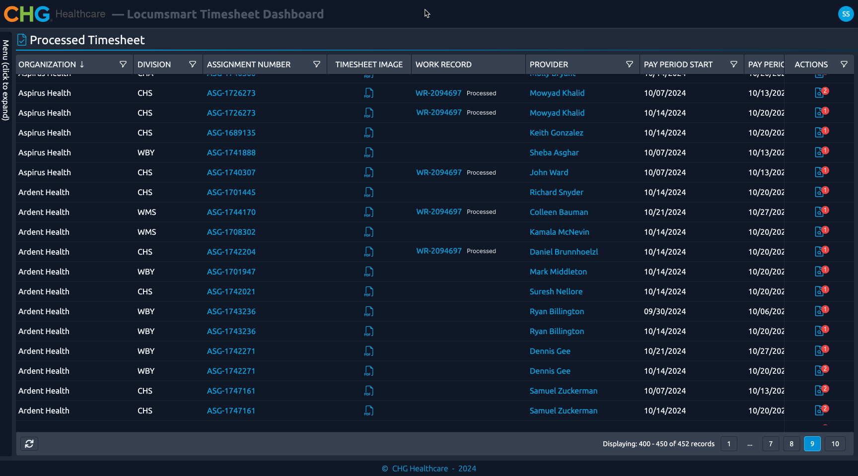
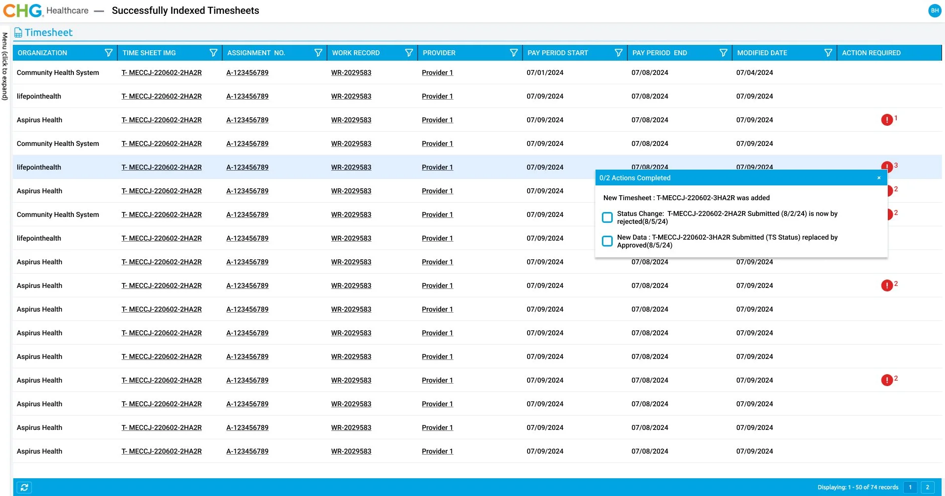
The successfully indexed timesheets table is a dashboard that shows all the timesheets that are indexed inside the internal tool using initial attributes provided by the stakeholders. Our users were drowning in a sea of notifications, leading to frustration, inefficiency, and critical information being overlooked. The lack of customization and prioritization options meant notifications often caused more harm than good.
Under a time constraint, I held quick ideation workshops with my PM to explore the solution space
why?: Since I was completely new to this platform and was under a time constraint. I started off with really understanding the problem space with one-on-one sessions with the product manager where we talked about the problem and ideated rough sketches. To have a real concrete problem definition we decided to conduct initial user interviews,
User interviews showed initial designs of the notifications turned out to have readability issues
why?: After the initial round of stakeholder interviews, we redesigned the feature. We got a lot of pushback from engineering since that would require additional manpower and hours, but through the evidence we had collected in the prior meetings we were able to get our designs through
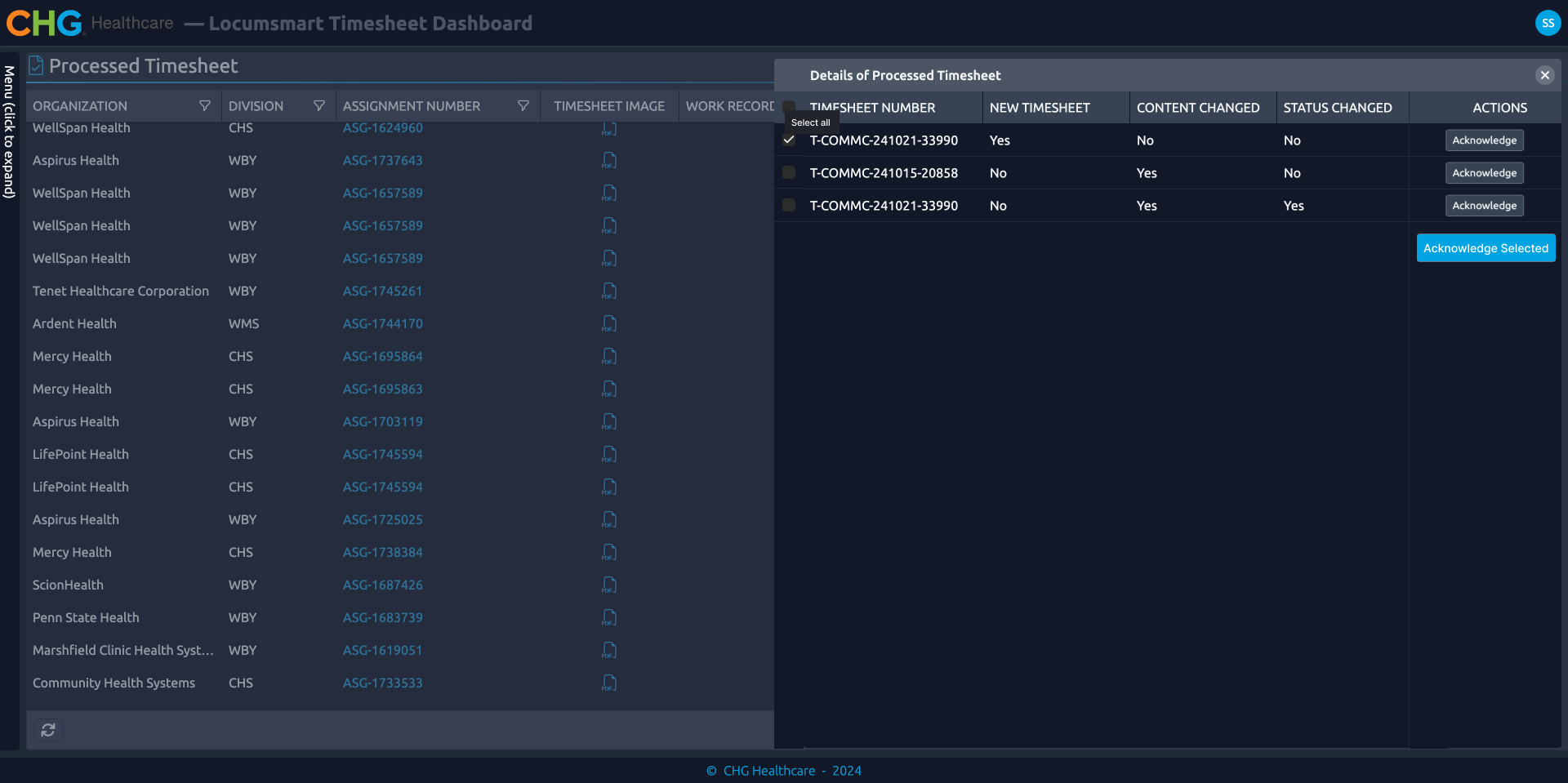
Restructuring the information helped the user’s to better read and understand the notifications
why?: After the initial round of stakeholder interviews, we redesigned the feature. I designed the notification feature into a checkbox modal where clear language would explain the necessary action.
We got a lot of pushback from engineering since that would require additional manpower and hours, but through the evidence we had collected in the prior meetings, we were able to get our designs through
Defining the Vision: Prioritizing Readability to Enhance Clarity
Our vision centered on transforming notifications into an easily digestible and actionable stream of information. Users were overwhelmed by cluttered and verbose messages, leading to missed critical updates. By focusing on improving readability, we aimed to ensure that every notification was clear, concise, and purposeful.
We envisioned a solution that prioritized:
Simplicity in Language: Notifications stripped of jargon and unnecessary details.
Visual Hierarchy: Strategically organized content with bold headings, proper spacing, and emphasis on key information.
Consistency: Uniform formats that reduced cognitive load and allowed users to absorb information at a glance.
This approach would empower users to quickly identify what mattered, fostering trust and increasing efficiency.
Impacts
Internal users were able to complete tasks 25% faster
5% increase in timesheet task completion
Collecting user feedback as evidence was really powerful
the solution was developed and has continued to receive positive feedback from users, I learned that collecting feedback as evidence can be powerful to get your designs approved by the wider team.