
Johar
Designing a safe, event-finding mobile user experience
Overview
Johar was a startup out of Arizona that was formed to help the creator economy and empower local artists and venues. The CEO had a technical consultant who had helped him build out a technical constraint set, which we used to ground our design decisions
My Role
Interaction design, user research, UI design and usability testing
Approach
People who like indie/small artists have difficulty discovering their local music shows, and due to this, smaller venues are at risk
Initial problem discovery
Smaller artists need smaller venues to perform and grow their art but due to the lockdowns both the artists and venues are at risks.
“Small clubs represented the starting point, before moving up a ladder of venue sizes to theatres, arenas, and stadiums. Then along came lockdown, and the future of that lower tier of venues is now at risk.”- Mark Mulligan ( Midiaresearch.com)
Evidence from a nationwide research study called Cultural Participation monitor showed that two-thirds of previous live event attendees (65%) have no plans for attending live events in the immediate future.
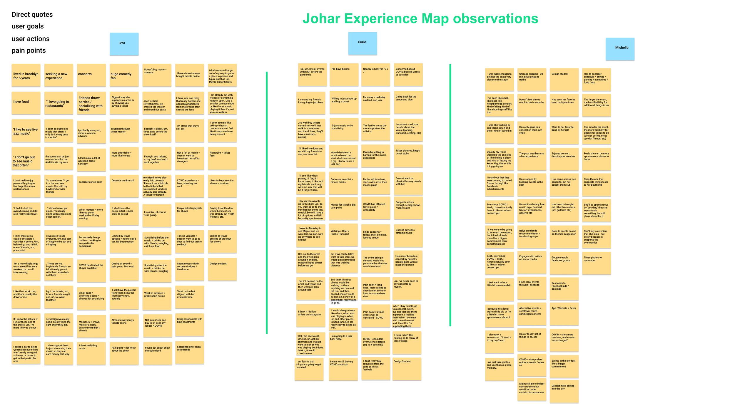
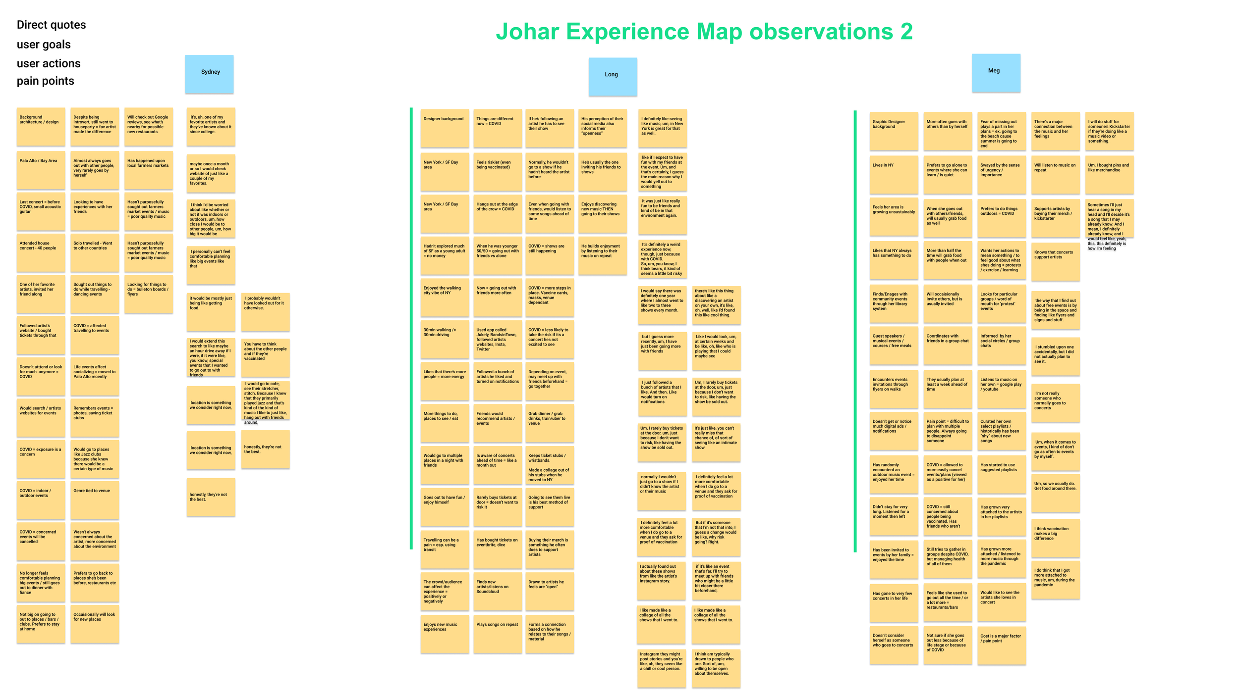
Remote User interviews showed…
People used to go to local concerts a lot more before COVID-19 but their frequency declined due to the complexity of safety in a pandemic setting
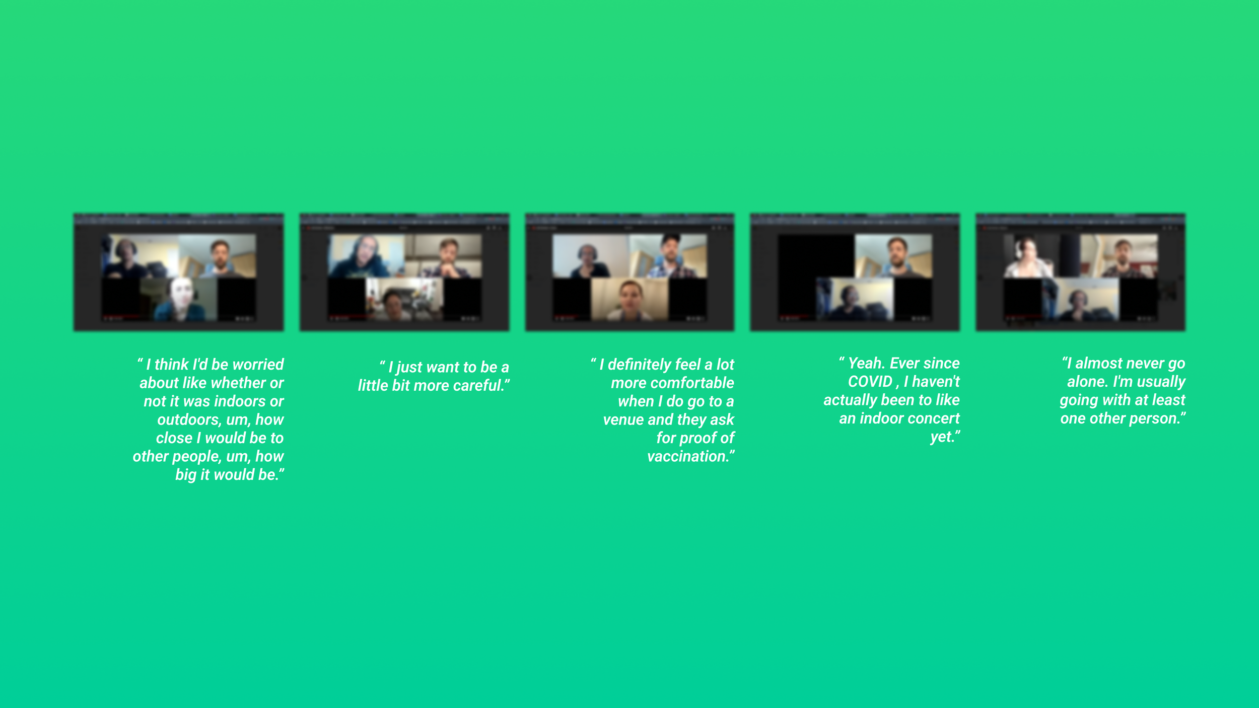
We carried out a thirty-minute interview to understand the mental model and context of frequent concertgoers. A survey was sent out on social media platforms like Facebook, Reddit, and Slack filtering out people who went to concerts and shows regularly.
We filtered out participants based on their outgoing frequency and venue choices
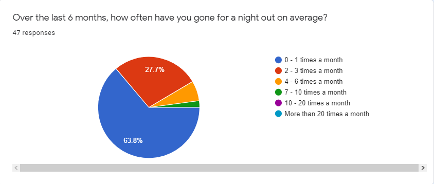
user survey showed that, the number of people that stayed home increased by 38% in the past 6 months

Due to a large number of user observations (200 +) gathered from the interview transcripts, I felt like the best way to analyze the current experience would be through an experience map. The red sticky indicates pain points that the user is facing in each stage
Experience Map showed that Users have the most number of pain points at the planning/deciding stage
Theme 1: Connection - 25 + observations
The audience needs to connect with the artist’s music or the setting/ vibe to book a show. Some audiences are more likely to go to a show if they already are familiar or intimate with the artist’s sound.
Theme 2: Safety - 30 + observations
Due to the pandemic audiences are concerned and confused about live events, especially in small packed venues. Out of 50 negative observations, 30+ were regarding their safety in a pandemic setting
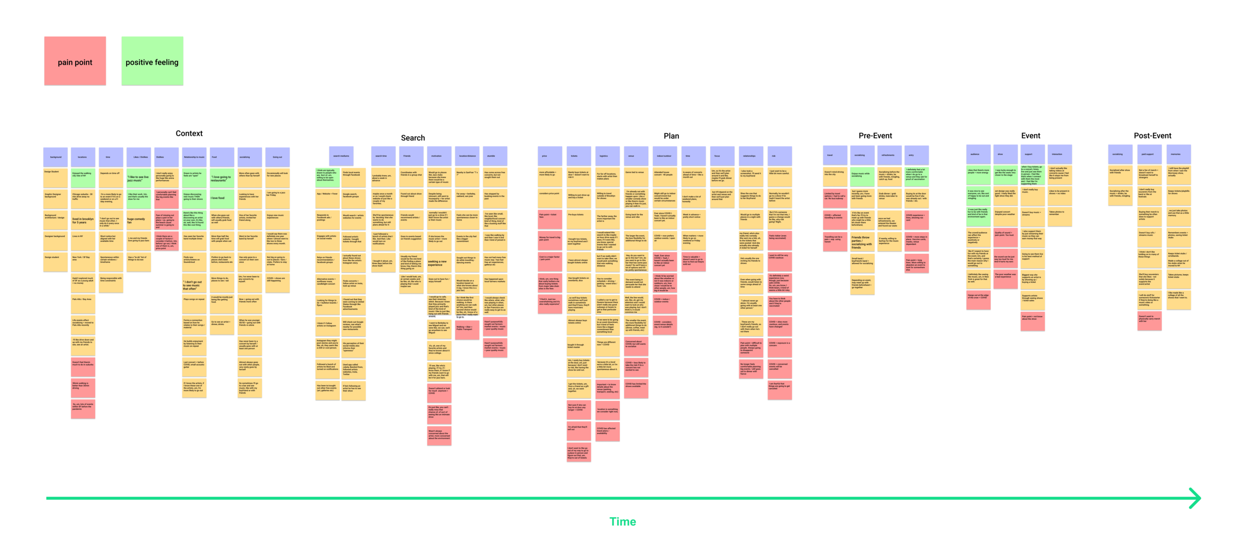
We focused on the problems of artist connection and safety
How might we create a connection between the audience and the artists so that the audience ends up going to their shows?
How might we reduce the complexity of safety in an event so that the users feel safe to purchase tickets?
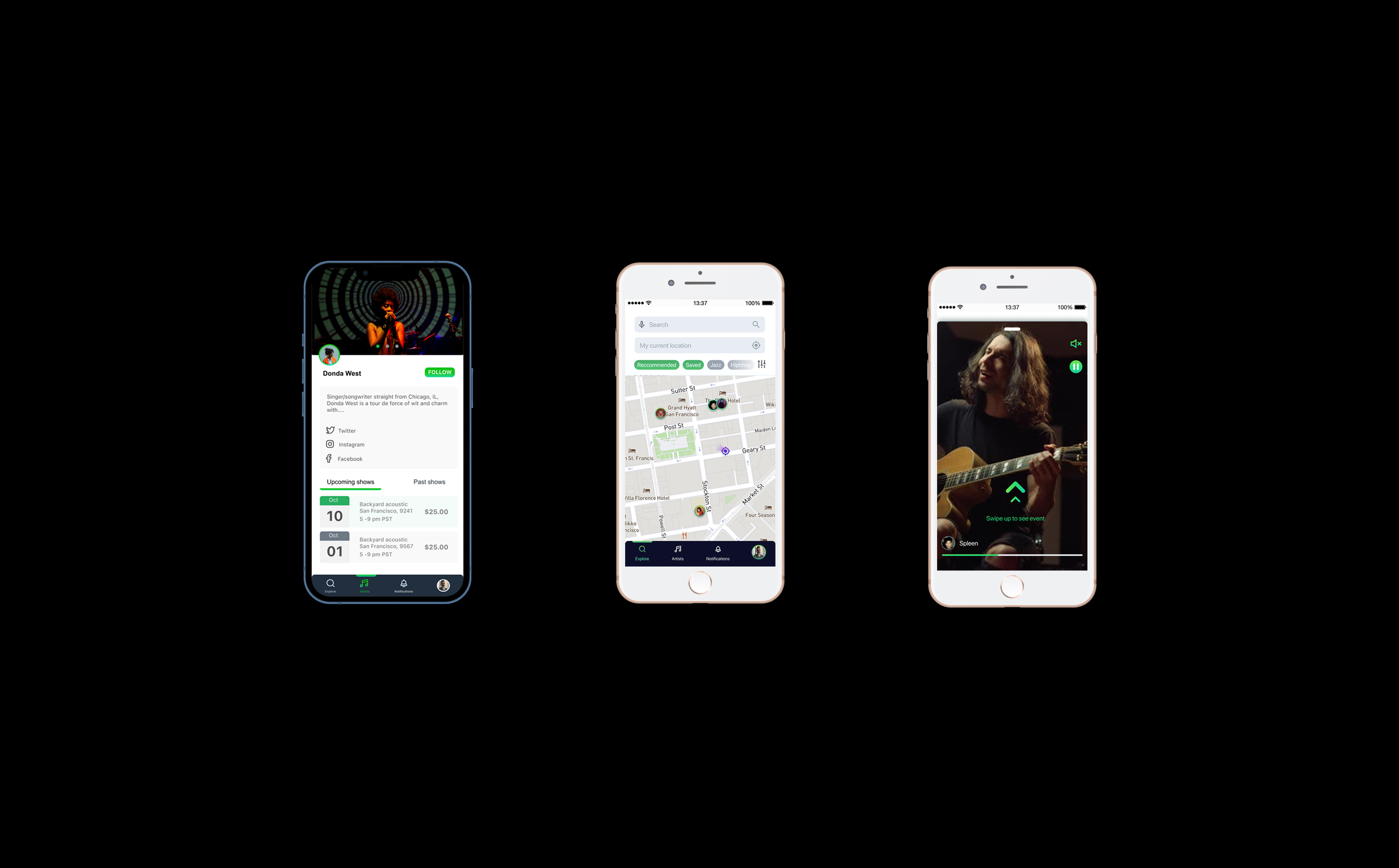
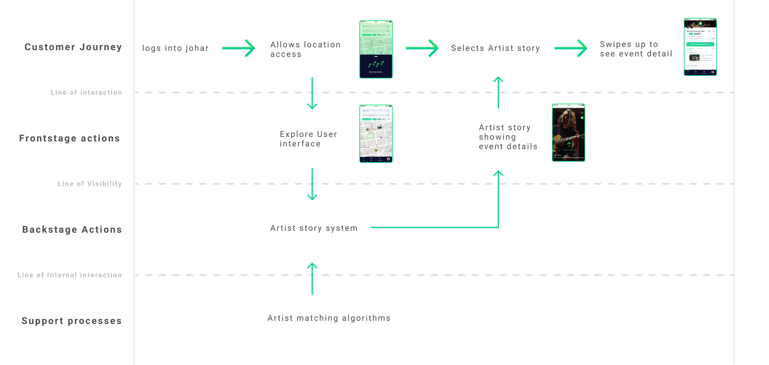
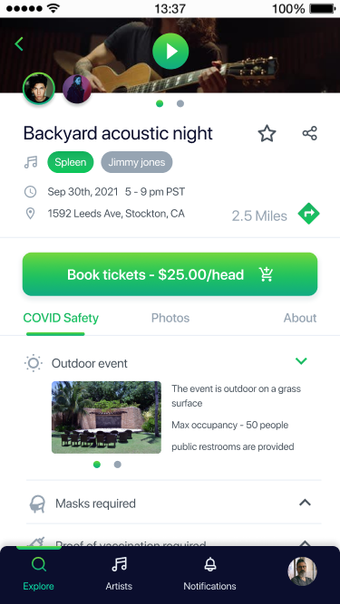
We Ideated an explorer page that allowed users to discover local artists and make easier decisions to choose an event
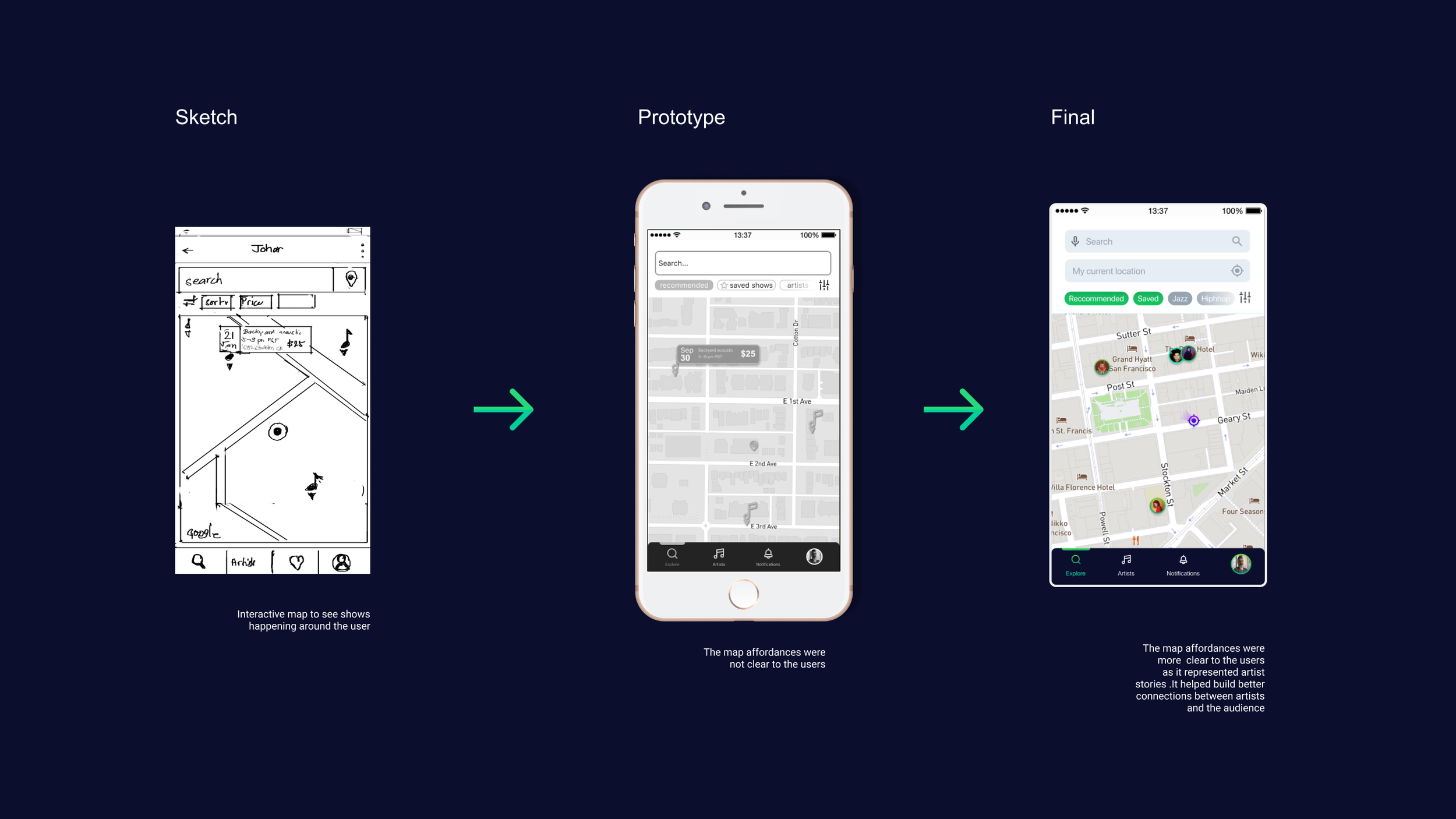
In order to make sure we accounted for the persona who was more spontaneous, we decided to use a map to visualize the artist’s location. The user would also be able to see any other places like restaurants and bars that would allow them to make a better decision
Also, the story affordances on the map would create a sense of urgency as most of the stories in other products like Instagram disappear after 24 hrs
An artist's story that shows the artist’s sound, venue, and overall vibe of the show. This would be the most expressive way to motivate both personas into looking at the event’s detail

Accounting for people’s short attention span a short snippet of 30 seconds of video would be the fastest way to convey a lot of information
Using the mental model bulit off of different apps like , instagram, snapchat and facebook would be critical to increasing usability
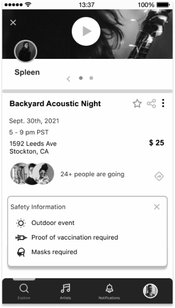
A safety information dropdown that reduced the complexity of scattered information and planning

In order to reduce the complexity of safety all of the major attributes like event venue, size, proof of vaccination etc needed to be complied in a single place
This would reduce the need for user’s to scour different platforms to find those details and communicate the value of the product
We created a quick Figma prototype to test…

Where do initial users of the product have the most friction?
How do users feel about their safety while using the application?
The user testing results showed that…
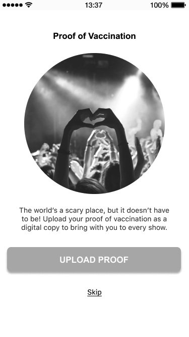
Some users felt the proof of vaccination was invasive
When the participants were asked to upload the proof of vaccinations 2 out of 5 felt uncomfortable doing so. One participant even claimed that it felt invasive and he did not trust companies with such sensitive data. We had felt to anticipate the intricate emotions users felt during this stage.
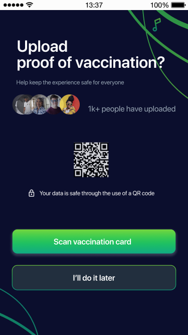
Iteration: Communicate the safety of their personal information using social proof / better UX writing
The safety information reduced complexity but…
2 users felt like it was not detailed enough to convince them of the event’s safety. We missed out on some pain points from the experience map due to the technical constraints
Iteration: Adding more intricate detailed information like venue size and ventilation that convinces the user of their safety at the venue
Results
An event finding mobile application that ensured the safety of the event goer
Support for the local musician and artist scene
Anticipate the user’s emotion during vulnerable situations like sharing personal and sensitive data
This project was really interesting and I learned a lot from it. It made me a better overall communicator as I had to defend and explain a lot of my ideas to the stakeholder. Every stage of this project made me learn something new about user experience and how it fits into the bigger picture. Even though we could not implement a lot of the research synthesis into our ideations it served as a great base for us to get started and test the solutions.